Guest Blog: Visual Wine Tasting (The Baker Method)
by Jim Baker (TXwineGeek)
Some of you may have already seen, the original and follow up posts on “Visual Tasting” by Jim Baker who has the TXwineGeek blog.
I did, and a few days later had to go back to view it again. Why? Well, the more I though about it (and unless I been sleeping under a rock far too long and Google had too), the more I realized how new and innovative Jim’s concept of visual tasting really was. I asked and Jim approved that his Visual Tasting blogs be republished as a guest blog on VintageTexas.
As background, in my engineering past, I’ve helped write computer programs that emulate human assessment, evaluation, judgement and selection. This process has made me very interested how our minds process information and make judgements and how this information is used in and engineering setting. I believe that Jim has found a new way to describe wines that may be better than our feeble attempts using glorified and often esoteric references to flowers, fruits, herbs and the all too ubiquitous descriptors of leather, forest floor, barnyard, smoke, wet dog and cat pee. We have all heard that “A picture is worth a thousand words.” I believe that Jim has found a new application of this profound concept.
I’d also like to propose that we find the right time, place and format to do a group visual tasting. My thoughts are to have a tasting of four wines with each participant provided a set of Tempra paints, paper and brushes. At the end of the tasting, all of the participant will post their visual tastings on a wall (while still enjoying their favorite wine, of course) to be compared, contrasted and discussed by the group.
Well, I’ve given my two cents worth….here is an excerpt from Jim’s “ten dollar” thesis on Visual Tasting.
— — — — —
Visual Tasting: Sandstone Cellars IV, and introducing something completely different
Excerpt from post on July 16, 2012 by JCBaker (TXwineGeek)
If you have ever been with me on a wine tasting, you may have noticed that I relate wine aromas and flavors more to colors than to other flavors. I only recently learned that this is a real condition classified under the general term “synesthesia” – my senses are somewhat cross-wired, and I tend to taste in colors. Of course I thought this was normal most of my life, but the first time I told Julie that something tasted green and got this puzzled look, I realized that not everyone did this.
I have a particularly hard time with wine tasting notes when I try to follow the “standard” model: make notes about the color, then the nose, then the flavor – with side notes about sweetness, acid, and tannin structures, then the finish. Although I understand the process and sequence, all of these flow together for me in a rush of colors, and it’s particularly hard for me to pick out individual aroma or flavor components without some assistance from Julie. That’s why I will never pass a Sommelier exam, I’m sure. What IS odd, though, is sometimes I will pick out a particular characteristic in a wine that no one around me senses until I point it out. The banana in Duchman’s Trebbiano is an example, and the Caramel (burned brown sugar, not the candy) in a wine I can’t remember right now.
OK, it’s a long introduction to the topic, and I am pleased with my selection of Don Pullum’s 2006 Sandstone Cellars’ “IV” to start my experiment, and I hope that Don is pleased and understands why I selected his creation to introduce mine: (See after the jump)

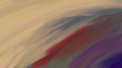
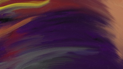
This is Sandstone Cellars’ IV as I taste it. The painting is a time sequence and profile of Don’s creation from nose to finish, so you interpret it from left to right. It starts off sweet and very creamy – much like a creme brulee – then picks up the darker, spicier tones of the Touriga, and finishes with that complexity. I showed Julie the drawing last night without telling her any of the colors’ meanings, and she was able to describe the flavors pretty accurately – she had not participated in the prior night’s tasting – so I decided to share this with you.
— — — — —
Visual Tasting: Alamosa Wine Cellars 2006 Texacaia
Excerpt from post on July 18, 2012 by JCBaker (TXwineGeek)
I think Jim Johnson must like “sleepers”.
When we visited Alamosa Wine Cellars in Bend, Texas – that was before they had the tasting room in Lampasas, I was completely fascinated with his still-in-the-barrel Viognier, but not overly impressed with the red wines we tasted. I bought a few bottles of the 2006 Texacaia because it was interesting, but completely “didn’t get” the Palette.
Several months later, Julie and I had the opportunity to share a meal with Jim and he opened a bottle of Palette for us saying, “This is a SERIOUS wine.” As the meal progressed, that bottle continued to open, and when I sampled the remainder of the bottle that he sent home with us the following day, it had REALLY OPENED UP and was some of the best wine I have ever tasted.
A couple of days ago I pulled one of the bottles of Texacaia and decided to see if it, like the Palette, was a “sleeper”.
With my Palette experience etched in memory, I poured the Texacaia through a Venturi to let it breathe quickly and open up faster, and gave it a few swirls for good measure, then started “painting”.

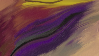
Dark, stone fruit, raisins, dried plums (OK, “prunes”), and smoky pepper caught my nose, and the flavor matched the nose fairly well except for this high note that I can’t describe except that I get the same flavor, only stronger, from every Texas dry “Lenoir” that I have tasted. It’s yellow with a black shadow for other syneshtetics. Unfortunately, that particular flavor can overpower everything else in a wine for me, and I lose interest in it; however, there was way too much going on in the Texacaia to give up on it. It has a “creamy” finish to it that I found particularly fascinating, so I finished the painting,corked the bottle, and decided to give it a day.

Day 2 – Very pleasant nose with lighter aromas present. Still mostly raisin, plum, pepper, smoke, but more of the complexity expressed in the nose. The flavor was slightly more “fruit-forward”, along the lines of a moonlit night being “brighter” than a moonless night. And that is just fine with me.
I picked up hints of tanned leather (the tamed version of the yellow/black I tasted yesterday) which meshed very well with the earthiness underneath. Slight overtones of black cherry, but the middle was a constant interplay of dark, stony, berries and fruit. The finish wasn’t as creamy as yesterday and it didn’t seem to linger as much as before, but it was a pleasant one.
Guess I need to order Jim’s latest Palette and Texacaia to compare.
— — — — —
VT – I’d like to get some serious discussion going on Jim’s visual tasting concept and how we can take it to the next level. It might even have an application in wine education, art education, wine reviews. It could even be expanded to include wine and food pairing. Jim, congratulations on this new and innovative look at wine. It’s good to know that there can be something new in wine after it’s long 6000 year history.

WOW. Thank you for the coverage, Russ.
I love color, even though I have a slight color-blindness, and when I upgraded my Slate to Windows 8 / Metro and discovered Fresh Paint that does a *wonderful* job emulating oils, I just started “doodling” with it.
The inspiration for “painting” the tasting came largely from the Sandstone Cellars IV itself. The label of the bottle has a painting by Bill Worrell, and the flavors were too lush – yet startlingly complex – for me to find words to accurately describe. I was left with color, so with stylus in hand and Fresh Paint on the tablet, I started my experiment.
I didn’t expect that anyone would “get it” – especially those who don’t taste colors, because the colors that I taste aren’t always the color of the berry, fruit, etc. that is closest in flavor. Surprisingly, though, many are, or are pretty close. NOTE: Apples don’t taste red, but grass most certainly does taste green. 😉
What made me decide to post the digital painting was Julie’s ease in understanding what I tasted just by looking at it. You never know, maybe it will help someone else.
Thank you again!
Jim
Russ:
I like your suggestion. Reminds me of an introductory design class I had in college. First session we were asked to bring a large pad of newsprint and oil pastels. Professor Kahn then played music and we were instructed to “scribble”. After each [or 6 or 8] widely diverse musical selections the class scribbles were posted and discussed. It was remarkable the similarity of colors chosen and the line shapes. Some selections evoked rounded line shapes, other evoked angular, etc.
I wonder what we’ll get with wines, hmmm.
If you DO decide to do the “event”, can I use my tablet and Fresh Paint? I like the “Undo” feature. 😉
Guess I’d need to bring a color printer, though.
(Julie suggests Memorial Wine Cellar as a good place to meet)
How about some real visual tasting of what’s in the bottle…. I’ve been photographing wine through the microscope and the expressions reveal qualities of taste. WHat about building on this…… http://sondrabarrett.com/2012/06/28/visual-taste-a-soft-red/ Many more visual tastes on my website.